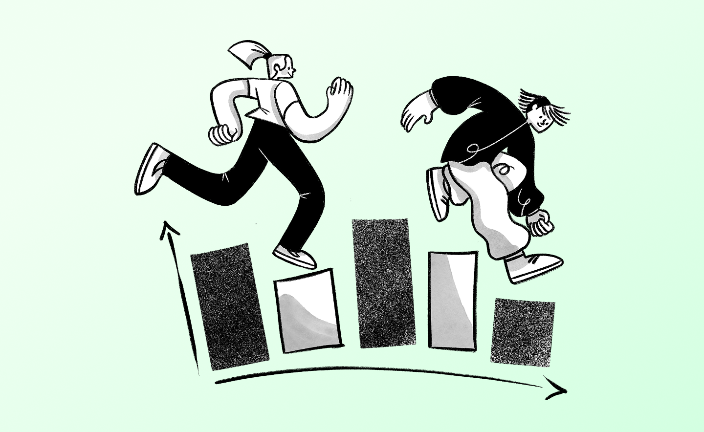
Topics
October 8, 2021
.avif)
October 8, 2021
Hi. I'm Ben from Dscout. One of the great outcomes of our increased age of democratization is, very simply, the designers get more of a hand in the user research process. In this video, I'm going to share with you a framework that will make that process easier for designers specifically. It's called an "inventory." It's fast, it's flexible, and it will help you capture functional data from your users, which is to say contextual data. I'll explain what an inventory is, highlight a few applications when you might use it, and then conclude by showing a real data example that you can check out for yourself if you're interested to learn more.
Let's start with the what here: What the heck is an inventory and why might it be useful for designers as a research frame specifically? What is an inventory? An inventory is a way of structuring your research, using context to draw out examples. Said another way, you've likely had a moment during your design process where you think, "Man, I really wish I could see..." Inventories seeks to fill in the blank at the end of that statement and you might find yourself asking that question at a number of different points in your design process. Inspiration, for example, where you just need to see how someone already does something, or wishes that something would be done, or even more foundationally, you just want to see the things that they enjoy using, what delights them in terms of design, product or otherwise.
Of course, we often iterate as designers, we're choosing between two concepts or prototypes, and we wish we could see the feedback that folks have about each of them. Then of course, finally, once things are implemented into the wild, users are using the experience that we've designed. We want to refine and make better. Again, we ask ourselves, "Gosh, I really wish I could see when they're experiencing a moment of pain/experiencing a moment of delight." All of these are times when you might make use of an inventory.
That moment that I keep referring to is really important to the inventory framework. Inventories, frankly, need moments in order to function. If we think about what a moment is, specifically a moment for a designer, they're really crucial. We've heard before from strategists, innovation consultancies, and folks thinking about the holistic or service-mindedness of a design that a small, discreet moment packs a big punch.
First, there's a lot of them. Think about all the different individual moments that you have with an experience, not just your own, but with lots and lots of other products, services, and experiences throughout the day. They're abundant. They're not just abundant, though. They have the potential to be very emotionally resonant in both directions. That is to say, they have an effective saturation. They can be positive, "Gosh, it was so easy to use," or not so positive, "Man, I really had a hard time trying to..." These are often termed "marker moments." These moments, big or small, mark an experience for a user. They set the tone for whether or not they're going to come back, evangelize, try and figure it out, ultimately, use the experience/brand/service, whatever it is that you're designing for.
Because they're abundant and because some of them are emotionally resonant, they are impression-forming, and that third part, impression formation, is why the inventory frame is so useful. You can collect a lot of moments or few moments, but each moment has a lot of context to it. I think designers can often get bogged down by screens trying to say, "I just want to see someone doing this thing in this moment," but that's not often how our customers and users are thinking about or engaging with our experience. There's a lot of context that leads them into or upon a screen, and then there's a lot of things that happen after when they turn off, shut down, or leave the store, for example. Inventory focuses on getting not just their moments of interaction but tries to collect what was going on before as well as after, so a long way of saying, "Moments are very important," not just to inventories, but to any sort of user-centered designer looking to collect data.
Scaled up, that is, when you collect more and more of these kinds of moments, they really help add rigor to your decision-making. I know that we're often thinking, "Well, I'm not a researcher because my sample size isn't big." Certainly, you want to feel confident in the kinds of folks that you're talking to and that the information you learn from them can scale up, can say something about another user. Context and moments in inventories make it such that even a few moments can really help you as a designer or a user-researcher feel confident in the decisions that you're making based on those moments. That's a little bit more about what an inventory is and the importance of moments in the frame. Let's get to just some of the types of inventories you might use in your practice.
Most inventories, at least in the way that I'm conceptualizing them here, have a few things in common. The first we've already covered: They revolve around and are focused on moments. The other thing is that they use an active prime or trigger, which is usually framed or phrased with a show-me-type sentence. Now, the reason we do this is to help reduce any bias that might happen with recall. It's different to say, "Show me a time," or, "Show me when you're frustrated with the app," as opposed to, "Tell me a time when you were frustrated with the app." The former, "Show me when the app frustrates you," grounds the participants in the moment, in the context. You, as a designer, will get a lot more detail and complexity around what's actually causing that moment, good or bad. In these examples that I'll show you here, you'll notice that just about every one of them has a show-me statement, or it's framed in a way where the participant is capturing sharing the moment as or nearly as it happens.
Here are some prime examples. We often think about inventories in the physical realm, so something like a tour, "Show me what's in your freezer," or a space, "Show me places in your home where you feel productive," are very often used.
We also have two inventories around objects. If you're someone who works in the wearables space, you might ask, "Show me the things that you enjoy wearing," but you might also ask, "Show me things that feel comfortable on your body," or, "Show me the objects that you cherish," and you might find characteristics about those objects that you can imbue into the one that you are designing.
We also have digital examples: "Show me the apps that you can't live without." In this example here, "What does and does not belong on your social timeline in your feed and what does that say about you?"
Then finally, qualities. This could be both about a person or about a brand or a brand experience. Maybe you as a designer are trying to imbue your experience with a feeling of comfort, or you're trying to extend the idea of trust through your design. Why not ask a participant or a human, "What characteristics make up trust for you?"
Each of these is an example of an inventory. Now, with an inventory and with the way that you're grounding them in the moment via the show-me statement, you're able to pair and combine lots of different questions or just a few and get a lot of data. You could ask a scale question to unpack how frequently the thing that they're sharing with you happens and never/rarely/sometimes/often/or in a typical session, "Is this something that you experienced frequently to infrequently?" If you can ask for a media question, take a photo, take a screenshot, or of course, best yet, using a selfie video or an outward-facing video, take us to the scene, walk us through what's happening. What was happening just before, what's happening now, and what might this lead you to do? Hugely critical. Then finally, open ends: "How might this experience have been better? What were you trying to do just before this experience happens?"
To close, if you want to begin using inventories as a designer, ask yourself what you would love to see, what you wish you could see from those users. What are those authentic, exclusive, maybe hidden behind-the-scenes moments that you really wish you could see? That's a bit of a theory of inventories, why it might make sense to begin using it as a research frame. Let's turn to an example using a digital app-type inventory and really drive home how you might make use of this.
I'm going to be using dscout Express for this example. Dscout is a remote research platform. With Express, one of its tools, I can program a focused set of questions and send it out to a large and diverse population of folks who respond via their smartphones. That it's mobile lets me tap into the context that is so critical to an inventory. Again, we're looking for authenticity and exclusivity. The moments that might matter most to you as a designer aren't likely to happen in a focus group or even a one-on-one interview. They happen in the participant's natural environment and mobile lets me get at that.
For this inventory, I'm curious to learn about mobile app designs. Here, we can see the questions that I've programmed I'm asked questions like, "How important is an app's design relative to other features like the function of it, the rating of it, or maybe even privacy components of it?" I've asked them to rank all of those components. I've asked them for a screenshot of the app so that I can see what it looks like on their phones. I've got some other contextual questions here about usage, how long they've had it, and importantly, I've asked them for a screen recording, wherein they're going to show me using their phone's onboard screen recorder how they use it and what elements of the design they like. Again, it's more than simply a photo or video showing me the design. All of these contextual questions help me paint a fuller picture of why they like that design. That's important to the inventory.
Let's have a look at all of the folks' responses. I can get that via the entry grid view. Each of these individual cards is a completed response. There's a host of filtering and sorting capabilities that I can do. I can filter by questions that I've programmed. I can filter by demographic variables that might be of interest to me. That would help me narrow down because, as you can see, I have 101 people who completed the survey, each of them sharing a video, each of them sharing a photo, answering all of those questions that I just showed you. It can feel like quite a bit. It's a lot of great data.
Let's first start with our closed-ended responses. Before we dig into any one moment, let's take a look at what the data might be telling us at a high level. These are summaries of the closed-ended questions. I'm interested in particular how people ranked all those different features, and so we can see that here with this ranking question readout, it looks like function was number one, but design, thankfully, was a close second. That's good. We could have programmed a question that terminated people who didn't select design or asked them a certain question that made it such that design was top of mind for them. I wanted that to happen organically here and it looks like it has.
But this is interesting. This might be interesting to your product managers or even a marketing person wherein the brand is at the very bottom of these characteristics. That's kind of interesting. If we scroll a little further, we're going to see the frequency of usage of the apps that folks are reporting here. Daily is the most frequently reported usage metric, which is great. We want our designs to inspire, to encourage people to be using the apps as often as possible. That's just some high-level information around the closed-ended responses. Let's have a look at the open-ended responses.
Remember, we have a video, we had a few open ends, and so this will do the same sort of thing, but for those sorts of responses, giving us a summary and looking a bit at the frequencies of those, so we can see, rather, all the different open-ended questions that we programmed here in this question switcher. I'm going to go to question six: What is the name of the app? Because I'm frankly interested if there was any leaders, if there was any app that came through a lot that was like, "Wow, this app had a really good design."
The word cloud is showing us that Instagram, at least among these 100 participants, is an app that is top-of-mind as one that is well-designed. 12 people selected it. We can see some other ones. There's Amazon, Shopping, Spotify. Nothing else really comes close to the Instagram in terms of frequency.Now, what I can do is I can actually click into that bubble and I can filter just to those moments where folks are just to the folks who said, "Instagram is the app that I think is well-designed." Again, as a designer, you might want to do some competitive intelligence. You might want to do some iteration, some aspirational peers. You might have a design of an app who you like and you want to see how those tracks with your own. You can filter in and just take a look at those specifically.
I also programmed a question here, question eight: Distill this app's design into three single words. It'll give us a sense as to what aspects of an app's design are most kneel-moving for people. Now, we know this has experienced designers that okay, simple, easy, fun, intuitive. You could have probably told me that. However, having data to share with your stakeholders as to why you want to make a design decision or why you want to approach a design sprint in a particular way, especially if it's a different direction than maybe your stakeholders were thinking, having data always goes a long way, and so here we can see again, and these are exportable down here at the bottom left. You can export this if you want to drop it into a deck, share it in a comms channel.
We can similarly, just like we did with the brand names, I can click on anyone who said "clean." That's interesting, 11 people used "clean." I can click on "clean," click filter by responses, jump down to those responses, and then I can go into any one of those individual moments. Maybe there's some element that I'm missing as a designer, but I want to tease out, I want to have the resonance, I want people to say of my app, "Gosh, it's clean." That, again, is just some high-level gut checks around the closed-end responses and the open-ended responses. Let's go back to the entries grid and actually jump into one of these moments.
I'm going to click here in Jamie's. He's from Fort Collins, Colorado. This is what his answers look like on a granular level. We see information about him on the right-hand side and here are all his answers to the questions that we programmed on the left. He chose function, design, and privacy. Here are his ratings. I'm particularly interested in what he chose. He chose Instacart, a grocery delivery app. Here is that screenshot of him not using it, but of what it looks like in his phone's context on maybe the most important real estate in the world for many digital experience designers. There are his three words.
Here is that screen recording. Now, I'm going to mute it. We don't need to hear him because you can read it with this automatic transcription. This, for me, as both a researcher and someone who dabbles a bit in design, is where all the context can be found. Certainly, the open-ended responses are really important for that but watch what you're seeing here. Jamie is walking us through, not just visually via the app, but this transcript is of what he's saying here. He's giving us a narrated tour of why he likes the Instacart app's design, what elements of that Instacart design are attractive to him, how it helps him use the app.
Again, think about your own design processes: What do you wish you could see? What do you wish you could hear participants walk through? Here, we have one person, Jamie, spending almost a minute walking us and talking us through as well as showing us the app as it lives on his phone and what elements of the design are interesting to him. Jamie is only, as you can see, one of 101. The moments scale, and so you can look high-level at some of the themes, filter down to people you're interested in, and get to those moments where you can really draw out the context.
If Jamie were to say something that you or your team needed to get back to, there's nothing hard to understand when you look through it, you can highlight it. It'll show up there on the right-hand side. You can use a note to mention a colleague. It's all exportable, minable, siftable. It doesn't have to feel like research. You're sourcing moments of people using designs that they find delightful and you're trying to learn from it to improve your own. You could see, he wrote a lot in his open-end. You could search for those particular words, brands, again, adjectives.
I conclude the survey by asking folks, "What do you wish designers would change about the app's design?" Here, again, he's very cogent in what he has here, "I would invert the white dominant color of it to a black color and then invert all of the text form." Accessibility is on the minds of many designers and it appears as though it is also on the minds of many participants, too, so again, this hopefully drives home the importance of doing research, "doing" as the verb and "research" as the noun, broadly defined as a designer, as someone who needs inspiration, iteration, refinement, and of course, feedback on how things are being implemented with your designs.
You have 100 people here who are sharing with you their favorite designed app, why, and still, how it could be made better, but we could have really focused in for this example. I could have asked only Instacart users to share with me a good moment of using the app and maybe a bad moment of using the app, inventorying those sort of qualities, or I could have asked anyone who gets groceries delivered to show me the app that they like to use for that. The aperture that we use for this use case can be wide or as narrow as you need it to be.
But enough of me blabbering, if you want to take a look at these data for yourself, poke through the videos, make some highlights, see what you can see, click the link below, and you'll be added as a viewer. I really appreciate your time and I hope this video has showed you the power of inventory, both as a research frame, and how a remote research platform like dscout can help you quickly and intuitively start collecting data to make your experiences better. Thanks for tuning in. I'm Ben from dscout.