
Topics
December 9, 2021
.jpg)


December 9, 2021
Many of us have been pushed by stakeholders to include preference-based questions in our studies—questions like, "Which design do they like better?" or "Which design resonates best?" But because preference testing is based on opinions, the results are often unreliable and irrational and do not provide valuable information to the usability testing process.
In this article, I'll explain more about why preference testing is not a good research method by getting into the details of how we make such decisions and the biases that come into play, show some real-world examples of how misleading this data can be, and some guidelines to follow if you still must include such questions in your research.
Let’s start with some definitions. The way I most often hear people define a preference test is when speaking of usability research that focuses on showing some design options to participants and asking them to choose their favorite.
Other types of tests focus on the visual/aesthetic appeal of the design—fonts, colors, and images that are expected to communicate brand traits. In these cases, researchers often ask users what seems more usable rather than actually testing its usability. This is the difference between opinion and behavior, an important distinction to make when conducting usability research as opposed to market research.
Aesthetically focused testing is not the focus of this article. While some may debate whether that type of research is truly usability testing, I want to focus on traditional usability testing, which is the evaluation and measurement of a product or service by having participants complete typical tasks with it. Then, using that format to ask questions about what users prefer or choose when showing more than one design option.
Asking people’s preference has face validity–we assume that what people prefer will also align with other positive things we want to impact, such as:
But how do we know that is true? As it turns out, research in the psychology field shows we don’t have a clear understanding of why people choose what they choose, much less what that choice may or may not predict.
I’m going to argue that the existing evidence indicates that preference questions do not provide value to the digital product user experience evaluation process, and actually may result in less usable experiences if relied upon exclusively.
Numerous books on bestseller lists over the years discuss the irrational and reflexive ways people make choices. We’ll use some examples from this research to discuss the participant biases that can make a big impact on the results of preference tests.
The framing effect is a cognitive bias where people’s responses are influenced by the way a piece of information is presented to them. It's one of several in a general class of judgment and decision-making fallacies identified by researchers, which were initially documented by Tversky and Kahneman in 1981.
One example of how framing can have an effect is in whether the piece of information is presented positively or negatively. Moxey, O-Connel, McGettigan, and Henry did a study in 2003 where people were asked whether they would have a particular operation and were told one of these two things:
They found that twice as many patients would opt for surgery when shown the first one versus the second. Also, in a meta-analysis of several studies conducted by this same group of researchers, test participants were on average one-and-a-half times more likely to choose surgery over other treatments when the treatment's efficacy was framed in positive terms.
Let’s look at another example of the positive-negative framing effect. This was a study by Irwin and Gaeth in 1998, where people were shown two versions of this meat and asked to evaluate it. Each group evaluated one of the two options shown below. The only difference was that one highlighted the percentage lean and the other the percent fat.

They found that the 75% lean product was evaluated significantly more favorably than 25% fat. Not only that, but the test participants then sampled the meat (not raw, hopefully!), and chose the one that tasted better and guess what they chose? That's right, the 75% lean version.
Choice blindness means that even when someone doesn't get what they choose, there’s a strong chance they won’t even notice and may even defend a choice that they think they made. This phenomenon was uncovered by a group of Swedish researchers in 2005. A couple of examples help to understand this process.
In one study, participants were shown two faces and asked to state which one they found more attractive. Then, shortly thereafter they were shown the face they did not choose and were asked to explain why they made that choice. Only a quarter noticed it was a different face, and several of them proceeded to defend their choice.
In another study on this topic, the same group of Swedish researchers asked Swedes during a general election about who they wanted to vote for and their opinion on a number of issues. Then the researchers altered their answers so that they reflected the opposite point of view, and then asked people to justify their responses.
They found that more than 90% accepted, and then endorsed, at least one altered response. Even more surprisingly, a week later they were asked about their positions again, and they found the more vociferously people argued for the opposite position, the more likely they were to remember and restate that view.
The substitution effect is another known issue with choice making, observed and defined by Daniel Kahneman in Thinking, Fast and Slow in 2011. It states that if people can’t come up with a choice quickly, they find a related question that is easier to answer and answer it instead.
Here are some examples (from the aforementioned book):
Target QuestionSubstitute QuestionHow much would you contribute to save an endangered species?How much emotion do I feel when I think of dying dolphins?How happy are you with your life these days?What is my mood right now?How popular will the president be in 6 months?How popular is the president right now?How should financial advisors who prey on the elderly be punished?How much anger do I feel when I think of financial predators?
The aesthetic-usability effect states that people are more tolerant of minor usability issues when they find an interface visually appealing. This means that a user could choose a design that is less effective in terms of task completion based on aesthetics.
This effect was observed by researchers at Hitachi in 1995. They conducted two experiments to see what the relationship was between apparent usability—what people think is usable—versus inherent usability, which is the observed number of problems with an experience.
The results of the analysis show that, "the apparent usability is less correlated with the inherent usability than it is with the apparent beauty," which is what people think is aesthetically pleasing.
In a test done by the Nielsen Norman Group on the Fitbit site, one participant experienced several usability issues, from minor annoyances to serious navigation problems. But in a post-task questionnaire, she rated her experience in terms of ease of use very highly, commenting that, “It’s the colors they used. Looks like the ocean, it’s calm. Very good photographs.”
Here is one more example of how choices can be fragile, although there are countless others. It's called the decoy effect. National Geographic did a study on popcorn sizes in 2013 (don’t ask me why National Geographic was studying popcorn). The first group got the following offer and most chose the small option.

The second group was given three choices with a decoy that was asymmetrically dominated, meaning not in the middle but closer to one end, as shown below. This time, most chose the large bucket since they saw more value in having that much more popcorn for only 50 cents. You can also see some of the other effects we’ve discussed coming into play here: anchoring and framing.

Given the number of ways that choices can be easily influenced, manipulated, or just not based on anything particularly rational, why do we want to measure them in our usability tests?
User Experience researchers support user efficiency, effectiveness, and satisfaction, which is usability defined. We already have valid and reliable ways of measuring usability that don’t have anything to do with people’s choices, so we should only add measures that are also valid and reliable.
I started focusing on this topic because I’ve often had requests for this type of research throughout my career. I used to add these kinds of questions to my tests without putting too much thought into it until I started diving into psychology research the past few years and started to question why we really do this.
To that end, I’ve been experimenting with adding preference questions to studies along with other measures and seeing how the responses compare. I’ll share a couple of examples with you. Both of these studies were designed to:
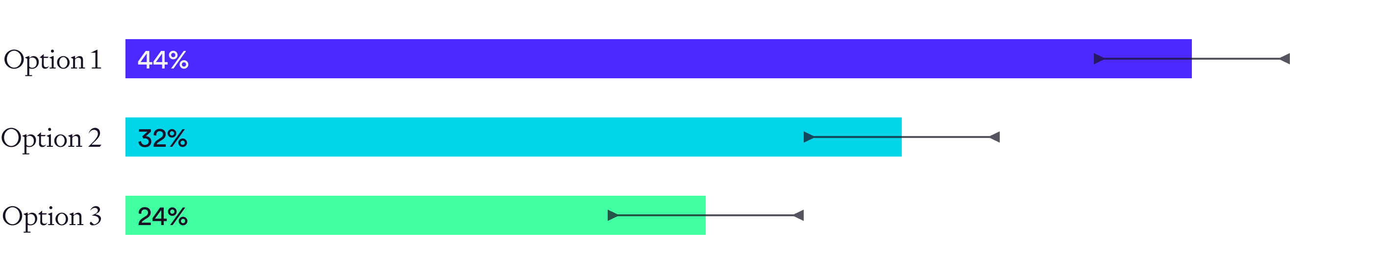
In the first study, three design options were presented for guiding users to products that matched their needs. This was a within-subjects study with 129 participants. When asked to choose the one they preferred, Option 1 was the clear winner. Note that the numbers here are an aggregated weighting score.

However, when I measured ease of use, understanding, and satisfaction after each option, Option 2 was rated, on average, more highly than Option 1, even though they chose Option 1.
So why the difference? Looking more closely at the data set, those with less investing experience both preferred and rated Option 2 higher, just not as strongly, whereas those with more investing experience showed the disparity but more strongly preferred Option 1.
Also, the reasons given for that group who preferred Option 1 but rated Option 2 more highly were largely visual—they liked the icons, the overall layout, or a particular interactive behavior.
This decision could have been influenced by one or more of these effects:
Let’s look at another study. In this one, three design options were presented for displaying projected income from an investment over a given timeframe, to test the hypothesis that a line chart was the best way to present such information. This was a within-subjects study with 160 participants. When asked to choose the one they preferred, Option 1 was the clear winner, as shown in the chart below.
Option You’d Most Like to See:
However, when asked after each option to independently evaluate understanding, confidence, and satisfaction:
Why the difference in outcomes here? Segmenting out the data set on key variables showed no difference to the pattern. The reasons given for that set were largely based on their preference for data like this being displayed in a chart format since that's what they are used to.
Again, one or more of the previously discussed effects could have impacted the participants' preferences in this study.
These are only two studies so it’s not definitive proof, but in both cases, one design was rated higher on independent variables related to usability than what users preferred, providing support that preference doesn’t correlate with usability.
Perhaps future studies will find positive correlations with other outcomes that would be considered desirable, so that is an area of research opportunity.
So, if I haven’t convinced you not to include preference questions in your usability tests, or if you are unable to win an internal battle and must do it, use these guidelines.
After asking users what they like or prefer, ask them to explain. Carefully analyze these results to separate responses that don’t relate to anything that truly impact usability and that likely come from one or more of the decision-making effects we discussed.
Warning: As mentioned, people don’t always know why they make a choice, so this is a “better than not doing it at all” recommendation for those who must preference test. I don't advise putting a lot of weight on these responses, but they can help to ferret out potential choice effects.
Don’t just ask which one users like or prefer, make sure to do tasks and measure other dependent variables you want to impact with your design options, such as:
Rather than, say, measuring ease of use by asking users to choose the one that was easier, ask the SEQ (Single Ease Question) after each option and then compare the results to look for significant differences. This typically requires unmoderated higher-volume testing.
If comparative results either:
The independent measures should be the deciding factor. Make sure your team agrees on this beforehand. If you’ve planned the research properly, you’ve identified the dependent variables you want to measure and have agreed on those, so they should be the most impactful results.
One last thing I want to mention. I don’t know how reliable or valid preference testing is in relation to many other applications; it may turn out to be quite valuable in other uses, although I would ask you to consider the Pepsi Challenge taste test and how that worked out.
Briefly, shoppers in the Pepsi Challenge taste test found that Pepsi was preferred by more people, even though Coke was by far the market winner. They launched an advertising campaign around this finding which led to an initial bump in sales, but they found that it didn’t last.
When looking into why, researchers found that because Pepsi was slightly sweeter, it had the “first sip” preference because it was slightly sweeter. However, when people drank a whole serving, they didn’t like it as much as Coke. These test results led to the New Coke debacle, where Coke responded by creating a sweeter version of Coke that tanked in the market and was hastily yanked from the shelves.
A can of New Coke is now a collector's item.
Molly is a User Experience Research Manager in the financial services industry. She has a master’s degree in communication and has over 20 years of experience in the UX field. She loves learning more about how people think and behave, and off-work enjoys skiing, reading, and eating almost anything, but first and foremost ice cream.


